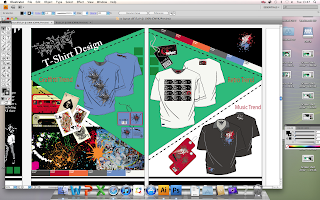
Now that I have decided on my colour scheme, design style etc I moved on to putting in my projects. My first step was to design a project title page that is consistent with the design and one I can use for all my projects.
I kept with the triangle black/green style. Changing small parts to make it more interesting e.g. changing the lines to white for a negative effect.
I am going to use the piano effect for the title pages but not the actual pages with the projects on them as it takes up vital space where I could be showing more work.
The front cover, contents page and title page all work well together when placed beside each other.
I wanted to include the colour scheme in my tshirt design section as all three designs follow the same palette.
I dragged the swatches on the end to fit into the triangle. Makes it look more neat.
For the promotional items I am only going to use the swingtags as i think the other parts make the page a little messy.
I think the inclusion of the graphics board is a good features as it shows where the inspiration came from.
Just to tie it all together I used one of my 'Respect' Logos as the respect title for the page and included the graphic from the music trend tshirt in the top right hand corner instead of leaving it blank.


No comments:
Post a Comment