Monday, 30 April 2012

Reworked 3


For the next image I used the pink blouse as the main focus.


I kept the design similar to the other two just varying it slightly. For this one I overlapped the images over the main image.


I moved the logos to the top for this one.


Final Image.

Reworked 2


For the 2nd reworking of the Debenhams images I used the light grey varsity jacket.


Since I am not focusing on the dress I used the black in the sleeves as the block colour.


Like before I got the three images showing the details of the jacket but didn't make them too big as I didn't want them to take focus away from the main image.


Since the writing is over black I change it to black and the dividing line white as well.


I put in a dividing line from the image as well as the background is quite dark.


Final image.


Reworked 1


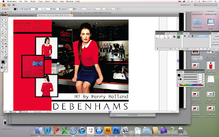
I took inspiration for my design idea from the Debenhams website. I decided to focus on a certain piece of clothing from my images instead of them as a whole. For the first image i used the red peter pan collar knitted top.


Like a lot of the Debenhams promotion they use block colour backgrounds. I decided to use a red background to bring out the red in the top. To show the detail better I used the images from the website to promote the top more.


I originally placed the logo over the two colours but later thought its not that clear. I played around with the layout of the images on the left, trying to find what looked the best. 


To make them stand out more I placed a navy box behind them, to compliment the navy skirt.


I included the name of the item and the brand 'H! by Henry Holland so customers seeing the promotion know where to go to get the item.


I decided to change the layout a little, make it more structured with black lines separating the logos and images. Also changed the boxes to black instead of navy to keep it consistent.


I think less red works better as it doesn't take too much focus away from the actual image on the right.

Final image.


Debenhams Reworks

My initial thought for reworking my Debenhams images was to create a trend pack but i think if I designed some promotional items for Debenhams using the images it would work better with my other projects in my portfolio.


To make sure it fits in with the current brand I looked at some previous Debenhams promotion. 


Block colour plays a big part, this is an aspect I want to include in my designs.

I edited the final images for the group project. My plan isn't too change them too much from what I have already done, maybe just brighten them up a bit as I have already airbrushed and removed the impurities. 

Saturday, 28 April 2012

Portfolio Layout ideas

For the portfolio layout I wanted to keep it similar to the CV design, colours etc so they will work well together. 

I liked the idea of sectioning it off with triangles. Its a nice change from placing everything in boxes like I usually do.


For the front cover I have decided to use the same graphic I have in my CV. Since I designed it I could use it as a logo to represent me.


I started inputting my TShirt designs into the layout to see if it would work. I think it works well but for other projects I could change the size of the triangles to fit bigger pieces of work. 


I like using the full space of the triangle for things like graphic boards and mood boards, pieces the page together nicely. 


Debenhams images

These show the Debenhams images I am going to use:


Idea for debenhams images..

When looking through the Debenhams images I was trying to think how I could communicate them in my portfolio. One idea is to do them in the style of a Trend Pack. This years projects didn't really have a trend specific project but since its still something I am interested in I thought it would be nice to include these skills. Throughout my CV and looking back through projects I think my strong points lie with design and designing a trend back would still communicate this.


To do this I will need to come up with a trend that works for all the images and write a bit about it. Including a colour palette. It will be surrounded by the 50s style as that was the inspiration for the shoot. 

The image above shows a basic idea of what I could do.


Tuesday, 24 April 2012

Final reworked app design


Part 3

For the Try before Dye section I have kept with the same idea as the other 2. Changed the main buttons to the proper iPhone buttons.


Part 2

I thought it would be worthwhile to rework the home page although I am still unsure if I am going to use it in my final 4 sequence as it doesn't have as much info as some of the other pages, if I did use it I would probably have it as the background image.


The main part I had to change on the home page was to change the buttons to actual iPhone buttons. So I inputed the black iPhone button from the GUI.


Since my app is colour co-ordinated I kept the 4 colours along the bottom to link it all together. The text has been changed to the Myriad Pro as well.


I did a few variations of where I wanted to place the buttons. I liked this way but thought it took away from the image in the background.


I decided it was best to leave them along the bottom together. It makes the most sense in terms of app design.


Since the back image is quite dark I decided to change the buttons to light grey so they stand out more, after al they are the main features of the home page.


This is the final reworked home page, it works well with the other images but would not be used as the front screen of the app images on my portfolio as it doesn't showcase my best design since it has limited functions since its the home page.


Re-working the app pt 1

I started of my reworking with the trend screen for the app, I liked the composition of it already so think I will just try to make it more realistic.


To begin I got the GUI buttons for iPhone which I was going to use and placed them on a separate art board.


The main buttons that I needed to change where the 'back' button and the 'home' button. As my previous buttons looked fake. I change around the composition a bit with the Toni&Guy logo now in between the back and home buttons. 


I changed the main text to Myriad Pro as it is the closet to the actual text used on apps.
I kept the 'info' section the same as i think they work well together.


Since the images on the section are links to various other parts of the 'Trend' section I have put boxes around them to make them stand out more against the pattern background. I have reduced the transparency slightly of the background so its not as over powering. 


This is the final outcome of the trend section. I think now it looks more realistic. I know need to decide what other app screens I want to use.

Re-work idea-app


I set out all my app designs so I could see what I have to work with. My re-working idea is to pick my favourite 4 screens and use the iphone GUI buttons to make it more realistic since when I design these screens I did not know about the GUI.

Project 1-App Layout


The first project I am going to re-work is my product development. Toni & Guy-Hair Meets Trend.

I used this idea in the background of my pop up, I think it is  nice way of displaying my app screens without having them sitting side by side. 

I need to go back and revise my app designs, chose my favourite to go to the front but I think I will display them like this on my portfolio. 


Monday, 23 April 2012

Debenhams Styling Project

These are the 6 final images for the Debenhams brief. On the day of the shoot I was the photographer, we took over 200 images so I am going to look back through them and see what my favourites were instead of the group decision.


I will definitely use this image as it was one of my favourites from the start.