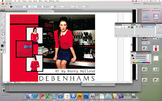
I took inspiration for my design idea from the Debenhams website. I decided to focus on a certain piece of clothing from my images instead of them as a whole. For the first image i used the red peter pan collar knitted top.
Like a lot of the Debenhams promotion they use block colour backgrounds. I decided to use a red background to bring out the red in the top. To show the detail better I used the images from the website to promote the top more.
I originally placed the logo over the two colours but later thought its not that clear. I played around with the layout of the images on the left, trying to find what looked the best.
To make them stand out more I placed a navy box behind them, to compliment the navy skirt.
I included the name of the item and the brand 'H! by Henry Holland so customers seeing the promotion know where to go to get the item.
I decided to change the layout a little, make it more structured with black lines separating the logos and images. Also changed the boxes to black instead of navy to keep it consistent.
I think less red works better as it doesn't take too much focus away from the actual image on the right.
Final image.


No comments:
Post a Comment